OCULOOP ARTSPACE BLOG
Surface pattern design and illustration.
Welcome to OcuLoop’s blog about illustrating and designing repeat seamless patterns for fabrics and surfaces and the process that goes into each concept. Topics will include patterns specifically designed for home decor such as wallpaper and curtains to fabric designs geared toward fashion as well as artwork to be framed and hung on a wall. OcuLoop hopes our readers will find inspiration here and also enjoy this journey into pattern design and illustration as we see where it takes us.

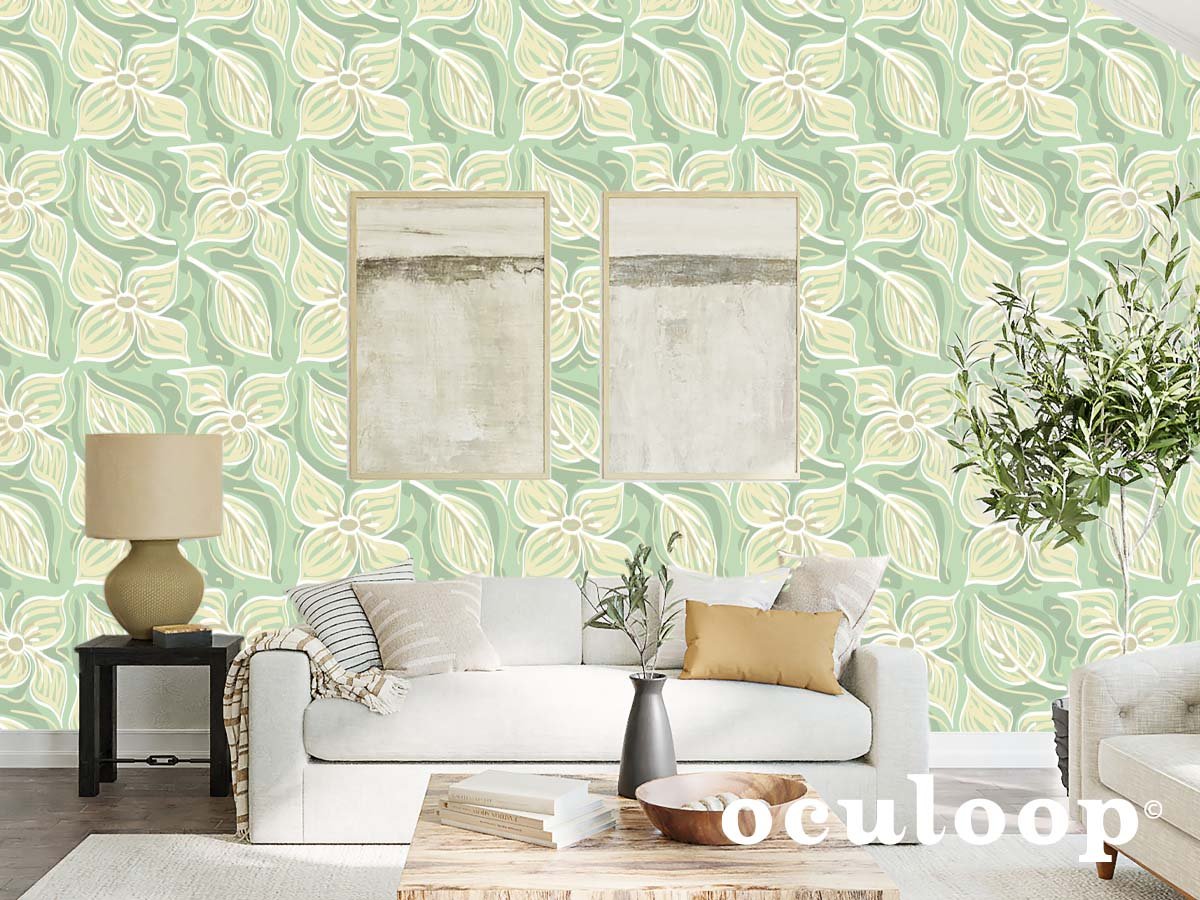
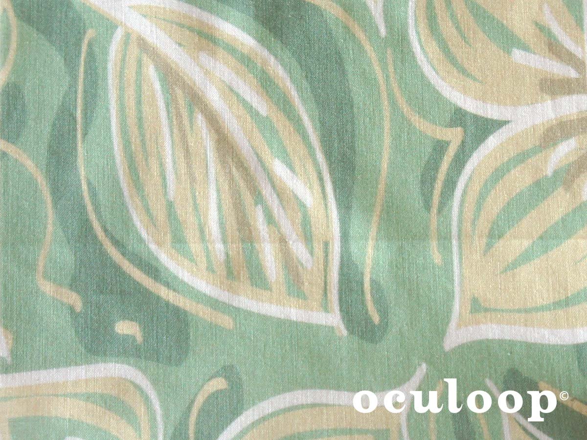
Neutral Wallpaper Design: Enduring Dogwood Botanical Pattern
Lovely flowering dogwood trees line the walking paths and are sprinkled throughout the neighborhoods of Portland. The flower is not only alluring, it’s durable and able to withstand hard downpours of rain. It makes sense that this beautiful flower is also known to represent the ability to survive life’s challenges.
Whenever I visit Oregon in the late spring, I’m reminded of the beautiful dogwood tree in my childhood back yard. These lovely flowering trees line the walking paths and are sprinkled throughout the neighborhoods. The flower is not only alluring, it’s durable and able to withstand hard downpours of rain. It makes sense that this beautiful flower is also known to represent the ability to survive life’s challenges.
For some time, I had wanted to work on a wallpaper design inspired by the dogwood tree, and I chose it as my subject matter for a Spoonflower challenge. The challenge was to create a botanical design in a neutral color palette to be used on grasscloth textured wallpaper. Choosing a color palette of soothing creamy tan and pale sage green, I set to work.
As I’m finding my illustration voice, I experiment with a few illustration styles when I start a new design. I know as an illustrator, it’s best to market myself with one very distinct look, but I find it hard to stick with one style. I have a few styles that I work with. My hope is that one of them will finally take over. With that in mind, I found working with loose and easy brush strokes for this piece felt right. In doing so, I was hoping to create a sense of the way the flowers and leaves move in nature. It was also an enjoyable way to draw since it was more freeing than some of my other work.
For me, I see this design as wallpaper or as upholstery fabric for furniture or curtains since the pattern is large at twelve inches. The calm, neutral colors make it versatile in a space. Find this design and more original illustrated surface and textile patterns on my Spoonflower shop.

Enduring Dogwood Botanical wallpaper and fabric surface pattern design by OcuLoop.

How I Started My First Repeat Pattern Design for Fabric
To get started I opened a new Adobe Illustrator document and began sketching flowers - all kinds of flowers, and I worked on experimenting with various illustration techniques.
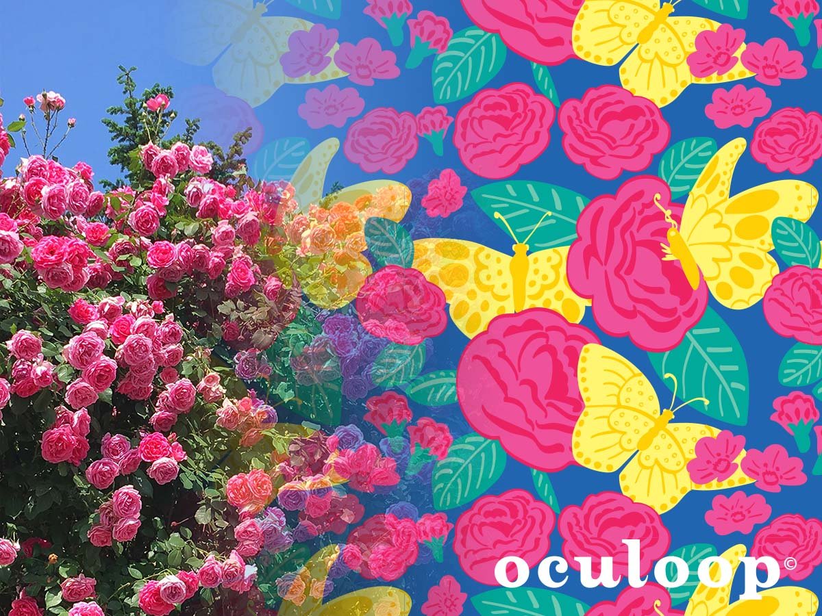
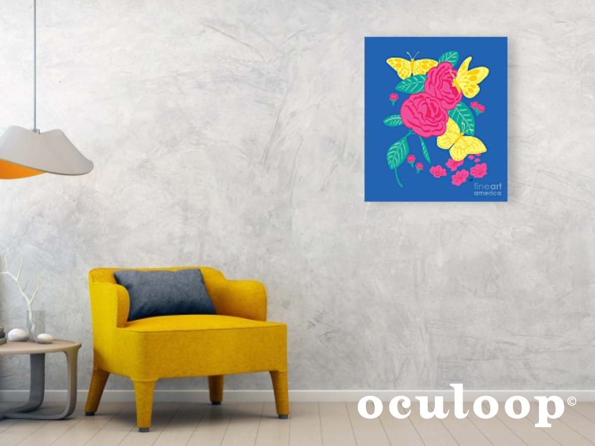
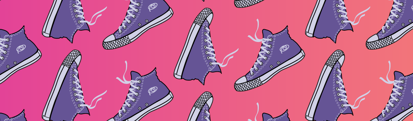
When I decided to pursue designing patterns for fabric and other commercial surfaces, I didn’t have a specific idea, so I looked to the nature around me. Living in San Diego, it wasn’t hard to be inspired. The colors are intense with bright blue skies and fuchsia bougainvilleas on every street. I also looked no further than the tree my balcony overlooks that is alive with lemon yellow butterflies every spring and summer. For additional inspiration, I thought of lounging in French manicured gardens sipping on fragrant iced tea in the summer.
To get started I opened a new Adobe Illustrator document and began sketching flowers - all kinds of flowers, and I worked on experimenting with various illustration techniques. Using a selection of brushes from my Wacom tablet, I started developing a method. Once I settled on an illustration style, I drew roses and other flowers, leaves and butterflies - keeping each subject on its own artboard. I also should mention, I started out with a color palette in mind - so I began adding color and finalizing some of the drawings I would be working with.
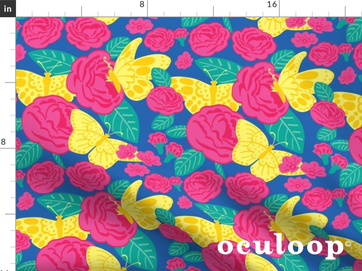
Next I started a new Illustrator document for the tile that would be turned into the final pattern. I set up four nine-by-nine inch artboards to experiment with a few compositions using artwork from the first document. Once I had those ready to test out, I turned each one into a pattern and narrowed them down to the final tile. Around the edges of the tile, on the top and the left side, I placed art that overlapped the edges of the nine inch artboard, changed Illustrator’s preferences to use increments of nine inches, then “copied” and “pasted in place” the overlapping art.
Next, I moved the top artwork that was just pasted one increment (nine inches) to the bottom and moved the left artwork one increment to the right. The result was the exact art on the top and bottom edges as well as on the left and right edges. The tricky part was next to arrange the artwork on the inside so that it wasn’t touching any of the art on the edges because that would mess up the seamlessness of the pattern. Adjusting the art in the tile to look seamless in the pattern took some time until it was difficult to see where the pattern started and ended. Also, once I positioned all of the art on the inside of the composition - making sure it didn’t touch the art on the edges, I deleted the art that was copied and pasted. Spring Butterfly Floral was the end result, and I’ve modified it since the first rendition.
That was my process in the beginning, and I’m still coming up with new methods of working efficiently and also narrowing down my illustration style for a cohesive look for my brand.
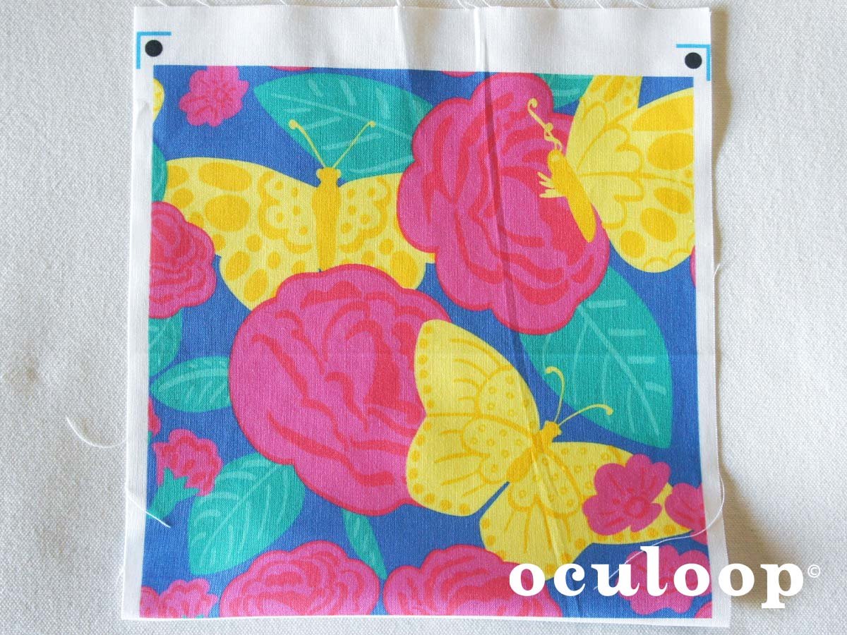
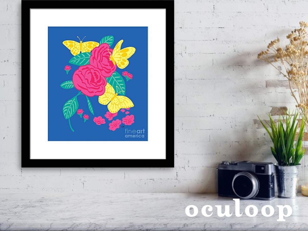
Now the fabric is available for sale on my Spoonflower shop where it’s also available in a variety of home decor products. Head over to my Pixels shop to order the composition as a colorful print either framed or on canvas.