OCULOOP ARTSPACE BLOG
Surface pattern design and illustration.
Welcome to OcuLoop’s blog about illustrating and designing repeat seamless patterns for fabrics and surfaces and the process that goes into each concept. Topics will include patterns specifically designed for home decor such as wallpaper and curtains to fabric designs geared toward fashion as well as artwork to be framed and hung on a wall. OcuLoop hopes our readers will find inspiration here and also enjoy this journey into pattern design and illustration as we see where it takes us.

How I Started My First Repeat Pattern Design for Fabric
To get started I opened a new Adobe Illustrator document and began sketching flowers - all kinds of flowers, and I worked on experimenting with various illustration techniques.
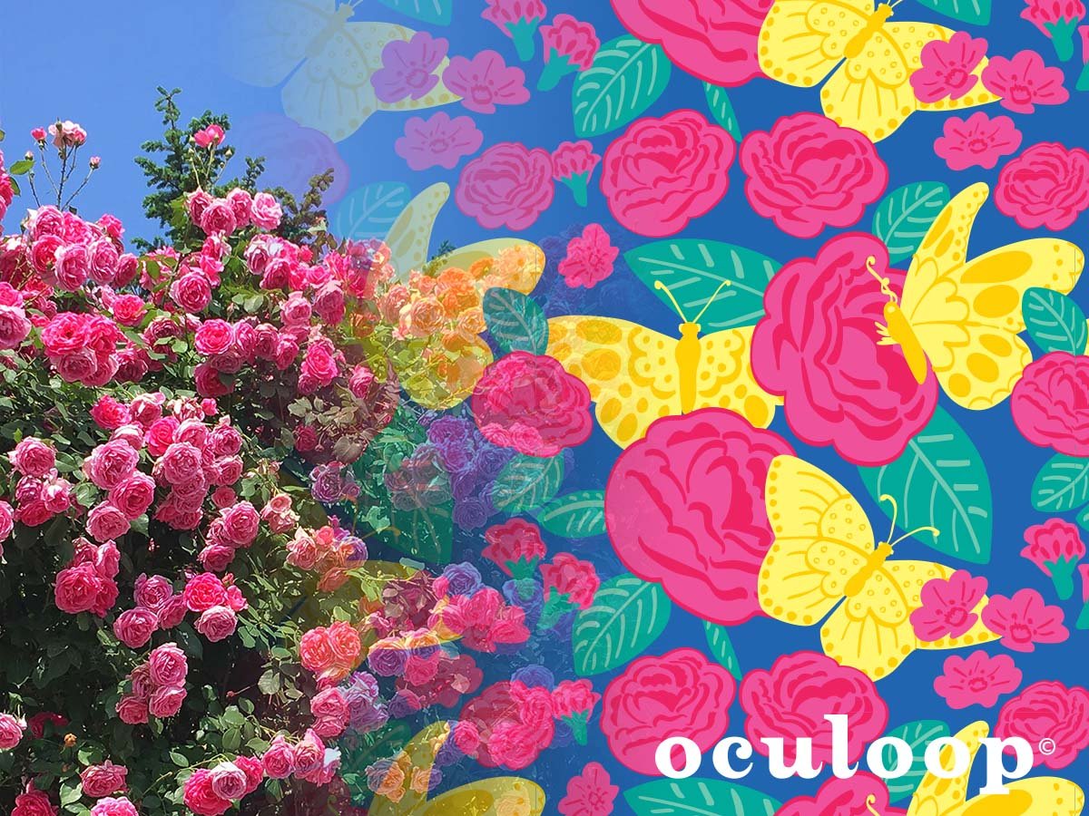
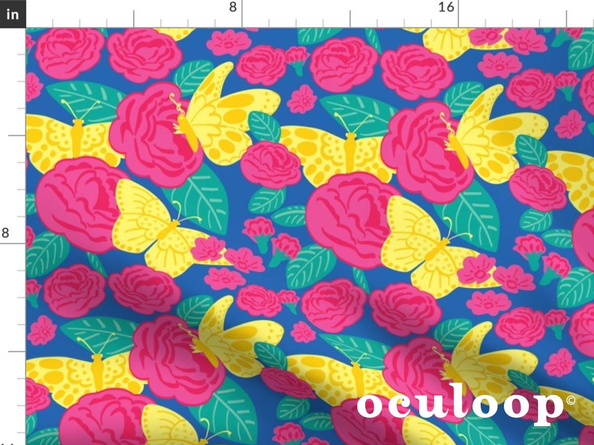
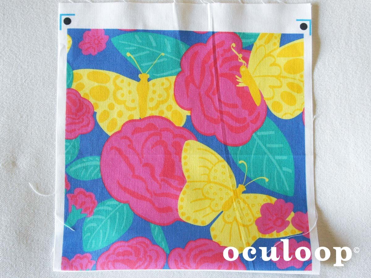
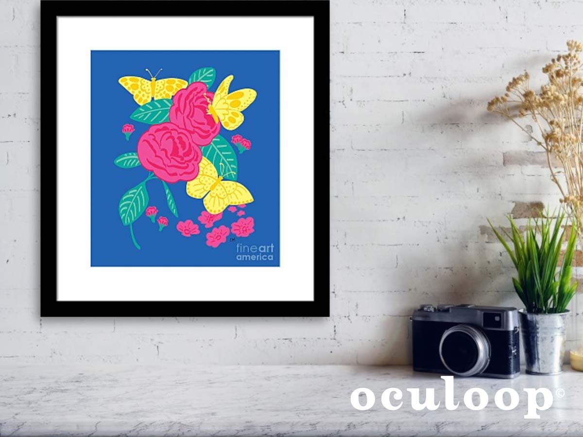
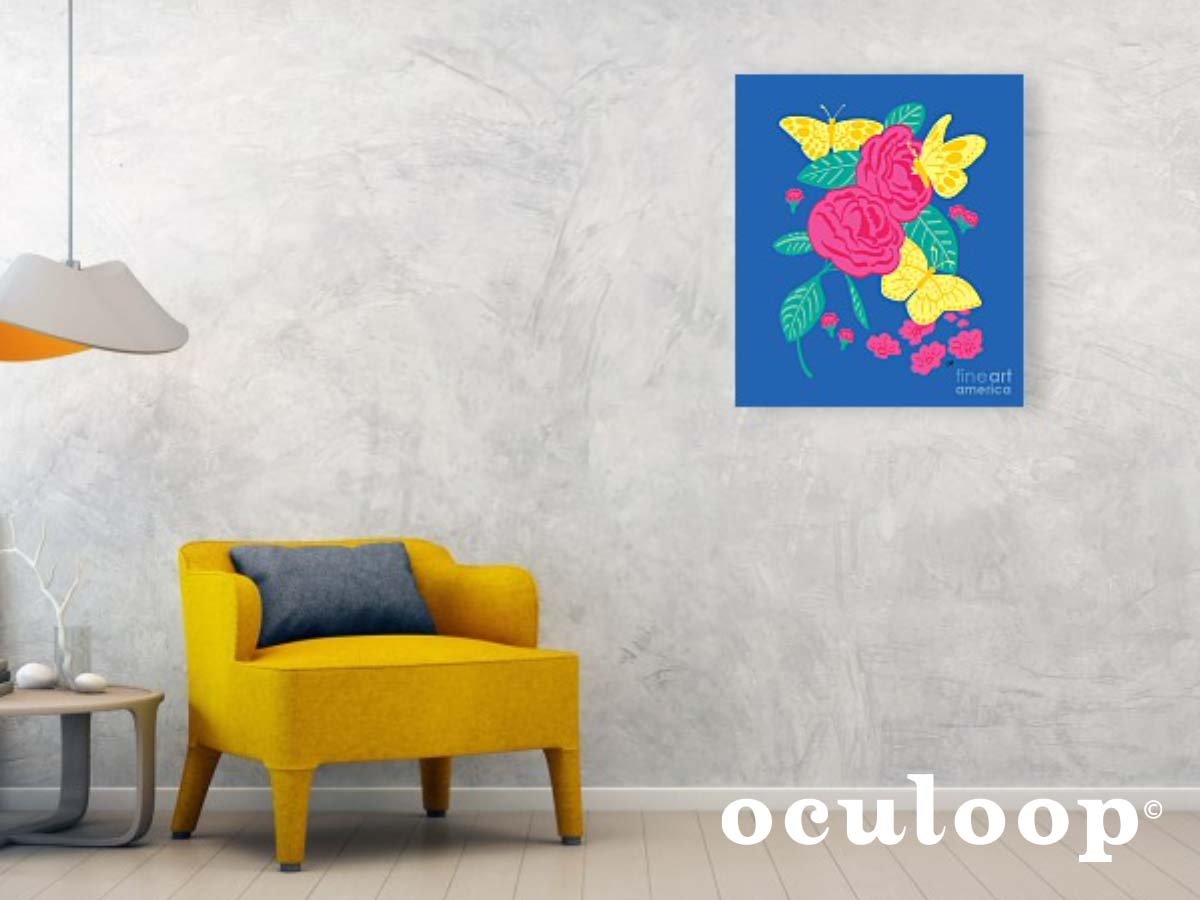
When I decided to pursue designing patterns for fabric and other commercial surfaces, I didn’t have a specific idea, so I looked to the nature around me. Living in San Diego, it wasn’t hard to be inspired. The colors are intense with bright blue skies and fuchsia bougainvilleas on every street. I also looked no further than the tree my balcony overlooks that is alive with lemon yellow butterflies every spring and summer. For additional inspiration, I thought of lounging in French manicured gardens sipping on fragrant iced tea in the summer.
To get started I opened a new Adobe Illustrator document and began sketching flowers - all kinds of flowers, and I worked on experimenting with various illustration techniques. Using a selection of brushes from my Wacom tablet, I started developing a method. Once I settled on an illustration style, I drew roses and other flowers, leaves and butterflies - keeping each subject on its own artboard. I also should mention, I started out with a color palette in mind - so I began adding color and finalizing some of the drawings I would be working with.
Next I started a new Illustrator document for the tile that would be turned into the final pattern. I set up four nine-by-nine inch artboards to experiment with a few compositions using artwork from the first document. Once I had those ready to test out, I turned each one into a pattern and narrowed them down to the final tile. Around the edges of the tile, on the top and the left side, I placed art that overlapped the edges of the nine inch artboard, changed Illustrator’s preferences to use increments of nine inches, then “copied” and “pasted in place” the overlapping art.
Next, I moved the top artwork that was just pasted one increment (nine inches) to the bottom and moved the left artwork one increment to the right. The result was the exact art on the top and bottom edges as well as on the left and right edges. The tricky part was next to arrange the artwork on the inside so that it wasn’t touching any of the art on the edges because that would mess up the seamlessness of the pattern. Adjusting the art in the tile to look seamless in the pattern took some time until it was difficult to see where the pattern started and ended. Also, once I positioned all of the art on the inside of the composition - making sure it didn’t touch the art on the edges, I deleted the art that was copied and pasted. Spring Butterfly Floral was the end result, and I’ve modified it since the first rendition.
That was my process in the beginning, and I’m still coming up with new methods of working efficiently and also narrowing down my illustration style for a cohesive look for my brand.
Now the fabric is available for sale on my Spoonflower shop where it’s also available in a variety of home decor products. Head over to my Pixels shop to order the composition as a colorful print either framed or on canvas.

Seamless Pattern Design: Geometric Beetles
Bold geometric shapes of the seventies combined with a jewel color palette. The surface pattern design is reminiscent of beetles encased in glass and worn like jewels.
Fig beetles are big iridescent green beetles that fly erratically and eat fruit. They’re so big, they can be confused with a humming bird for a split second - partly because they both share a beautiful iridescent green coloring and partly because they will both fly toward a glass of red wine on the patio. Though I wouldn’t want a fig beetle to land on me, they are kind of like big flying gems and they’re totally harmless.
When I saw there was a Spoonflower challenge to create a retro bug design, I thought it would be fun to come up with something. Beetles were easy to work with because of their gem-like quality. That’s why I also picked out an intense jewel color palette of emerald, sapphire and ruby pink.
When thinking of beetles and tying them into a retro illustration, I was reminded of the seventies when beetles and other insects were encased in glass and worn as jewelry, from big pendants, to earrings and rings. I’ve always found this jewelry to be disturbing, and I would never encase a fig beetle in glass like that, but I thought it would be an interesting avenue to explore in this illustration.
To capture the essence of the beetle jewelry, I worked with geometric seventies-style circular shapes with alternating gem colors and placed the beetles in the centers to be encased for eternity. The end result was a seamless pattern that made me happy I discovered the world of textile illustration.
After seeing the colorful fabric swatch I ordered, I looked at comps of the pattern on throw pillows and blankets. I imagine it brightening up a dark room or adding more color to an already colorful maximalist room. Find my retro beetle fabric design and other original illustrated patterns in my Spoonflower shop.

Image: Retro style beetle pattern design.
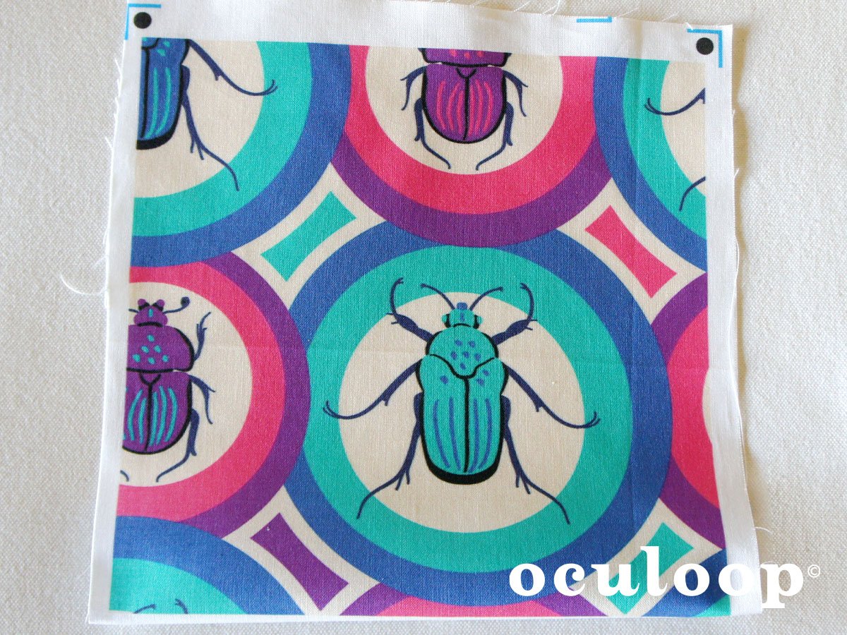
Image: Beetle pattern design printed on fabric swatch.

Pattern Surface Design: Y2K Happy Vibes Pop Print
This Y2K Happy Vibes pop fashion inspired repeat pattern design combines luscious colors with fun decal style icons of butterflies, hearts, daisies and dragonflies. Great for surface design and textiles.
Revisiting the early 2000s for my pattern design, Y2K Happy Vibes, was a thrilling exploration into a glittery bubblegum past. I was immediately reminded of babydoll t-shirts with big graphics, lots of pink lipgloss and the dawn of emojis.
Prompted by the Spoonflower challenge to create a Y2K pop fashion pattern design for fabric, I came up with a series of decals that reminded me of the era. Starting with an expanding heart decal, it set the tone for the rest: a butterfly, a dragonfly and a daisy with an emoji-like happy face at the center. The symmetry and consistency of each decal was important in creating a cohesive design with the different decals. To finish off the design, I added abstract decals between the recognizable ones and then worked on narrowing down my color palette.
One of my favorite aspects of designing patterns is finding the perfect color combinations. In choosing the color palette, I combined contrasting colors of luscious pink and coral with icy blue and petal pink to capture some of the magic of the era. I tried out a few other palettes using mint green and lavender, but settled on this one as my favorite combination.
When the fabric swatch of my Y2K Happy Vibes design arrived in the mail, I immediately felt happy looking at it and was glad the colors turned out exactly as I expected. The design repeats every nine inches making it a versatile size for fabrics whether for home decor or fashion. I see this as a print on a summer dress for Coachella or in a teen’s room on bedding, throw pillows or a wall hanging. Find this and my other originally illustrated pattern designs on my Spoonflower shop.


Pattern Surface Design: Retro Owl Floral for Pillows and Fabric
OcuLoop designed retro style owl and floral print that utilizes a fresh and updated seventies inspired color palette in big bold design.
Since this is my first blog post, I wanted to write about my most recent illustration for fabric, my Retro Owl Floral. I would never have come up with this imagery if it wasn’t for the weekly Spoonflower challenge with its prompt to create a pillow design using imagery found on a throw pillow in a 1970s home. My first thoughts were ugly, drab, brown and green graphics, but when looking for ideas by reviewing photos I took at a vintage store, I found some marvelous graphic shapes with minimalist lines, and the dated colors I’ve seen in brighter updated hues in recent decor trends.
In creating my seventies throw pillow design, it reminded me of strolling through vintage shops and outdoor flea markets and the feeling of finding that perfect nostalgic item to add to an interesting room. At first, I worked with an abstract geometric design, but found myself deep diving into a clean symmetrical owl illustration. I had also experimented with symmetrical daisies which I ended up adding to the owl illustration to complete the composition. The design relied on the consistent use of basic shapes and clean outlines that were big elements in much of the trendy seventies fabrics.
In choosing a color palette, I referred to a recent article I read on trending paints for home decor that showcased an updated seventies theme. The rusty browns were more orange and cheery and the greens had more cucumber than guacamole. Using my Pantone swatch book, I found the perfect swatches to create a retro mood with a fresh new outlook.
Overall, the quirky owl and daisies helped create an aspect of fun while working with aspects of nature which I always love. At eighteen inches, the big and bold tile design makes it ideal for throw pillows or fabrics for rooms or even fashion that want a sense of nostalgia and fun. It’s been pretty well received too with many Spoonflower members adding it as a favorite to their design libraries. Find this design and more on my Spoonflower shop.
